

The guild restored the dignity and prestige of the artisian which had all but disappeared with Victorian industrialisation. The artistic integrity using humble local materials with an honesty to function . Most Arts and Crafts furniture had an austere strong architectural form.
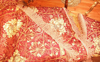
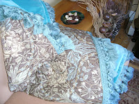
William Morris & Co produced style colourful embroideries woven textiles and wallpaper and carpets based on flowers, foliage and animals using natural animal and vegetable dyes.
At the same time Arthur Sanderson founded his wallpaper firm in 1860. From his premises in Soho Square, London, Sanderson distributed American, French, Japanese and English products, becoming one of the leading wall covering merchants in Britain. This period of success culminated in 1923 when Arthur Sanderson & Sons was awarded the Royal Warrant as Purveyors of Wallpapers to the King.
Architects of the time such as Philip Webb and F.G.A. Voysey designed houses in the same style. Rooms were light and spacious in white or pale colour natural coloured wood floors with rugs. Furniture plain and upright and largely made of oak. Walls often had picture rails painted a uniform pale colour to match the ceiling or dado or tongue and groove panelling. Windows treatments consisted of a simple style curtain hung from a pole.
Decorative motifs were inspired by nature birds, animals and flowers. The Arts and Crafts movement introduced olive greens, plum, hyacinth blue, burgundy, lemon yellow, taupe, rose, ivory, pale grey and white.


You may well have to work around an existing colour in a room in which case try to apply the above rule to your scheme, for instance in a lounge if you are keeping your suite, look at what you will have to incorporate.
If you are starting from scratch all well and good but if not you will need to work around existing furniture.The function of the room must also be taken into account when putting together a colour scheme. As a rule of thumb, rooms that are not used all the time can take stronger colours. Smaller rooms or those with small windows would benefit from pale, reflective colours.
Check out what direction house faces – eastern rooms need subtle warm colours. Yellow and muted orange work well, making the most of early morning sun and work well as sun moves away later in the morning.
West facing room benefit from cooler scheme, blues, violets to a green which will tone down the intensity of the light in the afternoon.South facing rooms will get the best quality light all day and therefore somewhere between the warm and the cool will be fine.
North facing rooms are obviously the darkest rooms and need the best artificial light and warm colours.
 If you would like to add a bold colour to your décor but are scared of going overboard why not add it as an accent colour to cushions, candles and pictures. You will get a feel for the colour and can easily tone the level down or raise it up by adding or taking these items away
 If a combination feels too strong then concentrate on using the paler shades and adding plenty of white or cream to cool a scheme down and just a few darker accents.
Pastels always mix more comfortably than other shades.Layer whites and creams together they will create more depth of tone.
If the colour values are too bright the effect can be disturbing a watered down version such as olive green and light pink works well.Use neutrals to pale down a scheme rather than on their own where they just look bland.
You can camouflage unsightly features such as radiators by painting them the same colour as the rest of the room making sure your paint is suitable for this or use a receding light colour.Emphasise features such as an imposing chimney breast or fireplace by using darker shades so that it will stand out.
 Large patterns in wallpaper generally suit large rooms or are best used on a feature wall even as curtains with a plain background in a small room they could be somewhat overpowering and make the room seem smaller.Small patterns suit small rooms and can give the illusion of larger space, small patterns in larger rooms can look spotty.
 Colours based on the yellow-orange-red part of the spectrum seem warm. The greater the intensity the more they move forward and the “warmer” the scheme. These are also seen as “fire” colours. Orange and yellow work well in a kitchen/breakfast room. Earth colours, which include browns green or gold, harmonize well together. They look good in family rooms such as the living and dining rooms.
Violet, blues, green-blues and black appear to recede and create a feeling of space. They are generally seen as cool colours. Air and water colours include grey, blue and silver. These can be used anywhere in the house but are most effective in bathrooms, bedrooms and halls.
Generally work with a larger area of the cooler, receding colour balanced by smaller quantities of the advancing complimentary warmer colour. Both can be modified in tone and intensity. This can be achieved by choosing one colour for the sofa and the other for the cushions, for instance.However, using pigments can easily modify different colours. Green-blues to which a touch of yellow has been added can appear vibrant and warm.Children love bright colour schemes but temper loud colours with plenty of deep contrasts and gentle harmonious tones